Handelsblatt Innovation Week
When the German newspaper Handelsblatt celebrated its 75th anniversary and 75 year of constant self-reinvention, innovation became the obvious motto. A new format was created, to happen not only in its anniversary year 2021 but every year after that.

For innovation is a constant state of mind.
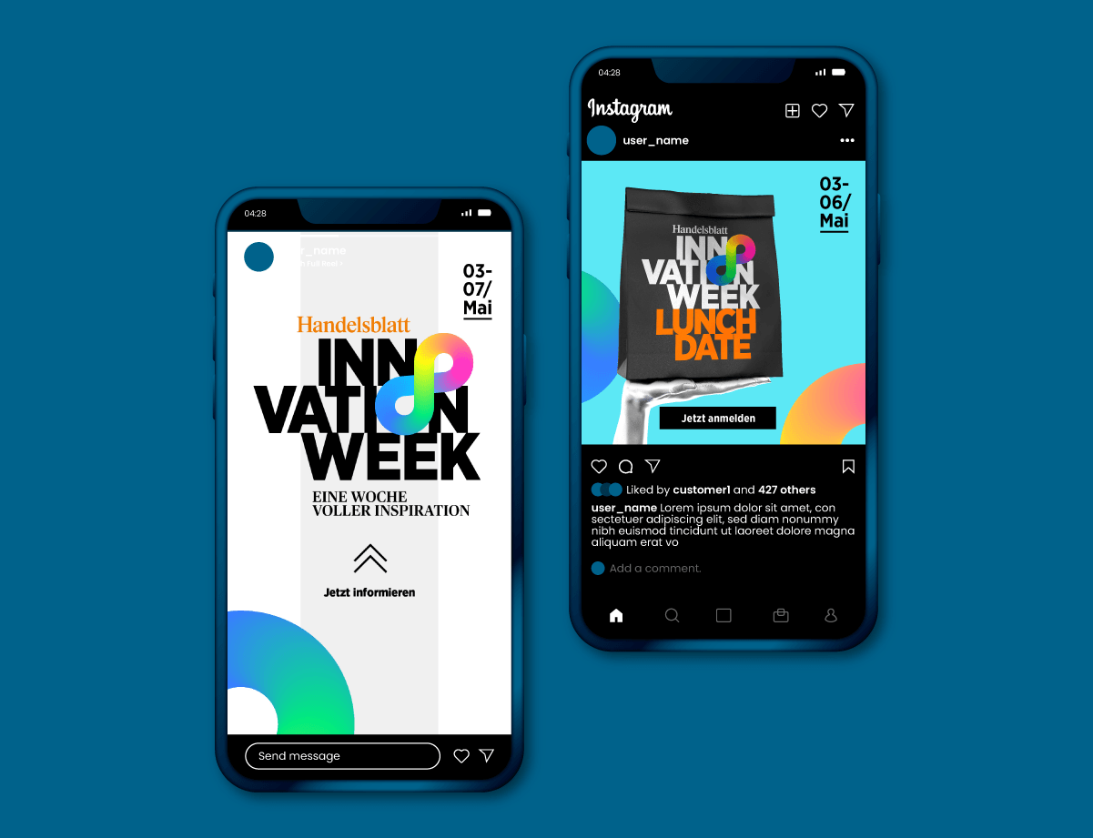
Examples of the cross media variation of the branding: From the general advertisement to the activation for specific events of the Innovation Week.
CREDITS
Creative direction:
JP
Art Direction:
Sven Knaebel
Employer:
atelier
Düsseldorf
Client:
Handelsblatt
Düsseldorf

A meticulous work of art direction at its best: entrusted with an expansion of Dyson's style guide. Tasked to seamlessly integrate a new product presentation section, the challenge is not to revolutionize, but to masterfully navigate the extensive and precise guidelines. It is the art of balance in a compliant mix of layout, art direction, and infographics, respecting the established rules while introducing a refreshing approach to product presentation. Witness the challenge of combining design innovation within the bounds of tradition.
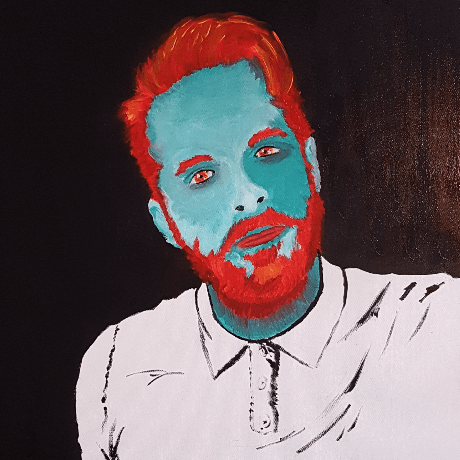
The solo activity that gives me the most satisfaction is probably painting. The conditions alone that necessarily have to occur: the time, the room and the quiet to exercise. The rewards of a won challenge like giving an eye a lively feel, or a daring color combination that ends up working out way better than expected, are nothing compared to the meditative effects painting brings along.
Korina is a dynamic force of energy, and her vibrant spirit is truly contagious. My branding revolves around capturing her youthful and punchy essence. Through a series of static and animated 'chibis' (simplified cartoon avatars), I've created a visually engaging representation of Korina. The design is rounded off with playful cartoony confetti, embodying the lively energy she exudes.

For their 120th anniversary, Nellissen Interiors aimed to 'refresh the branding' and address a lack of pride in their visual identity. Launching a special collection to honor the true founder, Emily Nellissen, the brand sought to recognize her often overshadowed role. The new logo, inspired by 19th-century handwriting, embraces the brand's femininity, while a minimalistic portrait of Emily enhances the 'full' version of the mark for use in the anniversary year and special events.

Though I am not a Christian, rebranding the St. Andrews Orchestra in 2022 became more than a graphic design task. Balancing tradition with a modern, youthful look, my Bauhaus-inspired logo features bold shapes, maintaining a serious tone in black-and-white contrast. This design captures the essence of a traditional institution transitioning into modernism, offering a playful touch.


