Ad campaign: '24/7'

Every brand has its own identity and its own pace.
Here is the last bigger campaign of the German newspaper Handelsblatt before its relaunch. To advertise the new functions of its app, the focus was on merits. In this case addressed through the headline mechanics.

'Inspiration for critical thinking 24/7.'
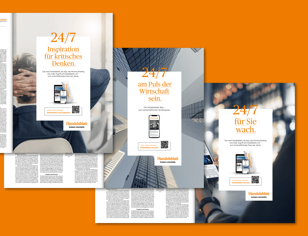
'To be 24/7 at the pulse of the economy.'
'Up 24/7 for you.'

'To start the day well-informed 24/7.'
CREDITS
Creative direction:
JP
Art Direction:
[team]
Copy:
Christopher Fink
Employer:
atelier
Düsseldorf
Client:
Handelsblatt
Düsseldorf
Die Vermessung Berlins: Ein Infografik-Buch über überraschende Daten zur Hauptstadt – und ein Blick hinter die Kulissen meiner ersten Buchveröffentlichung.
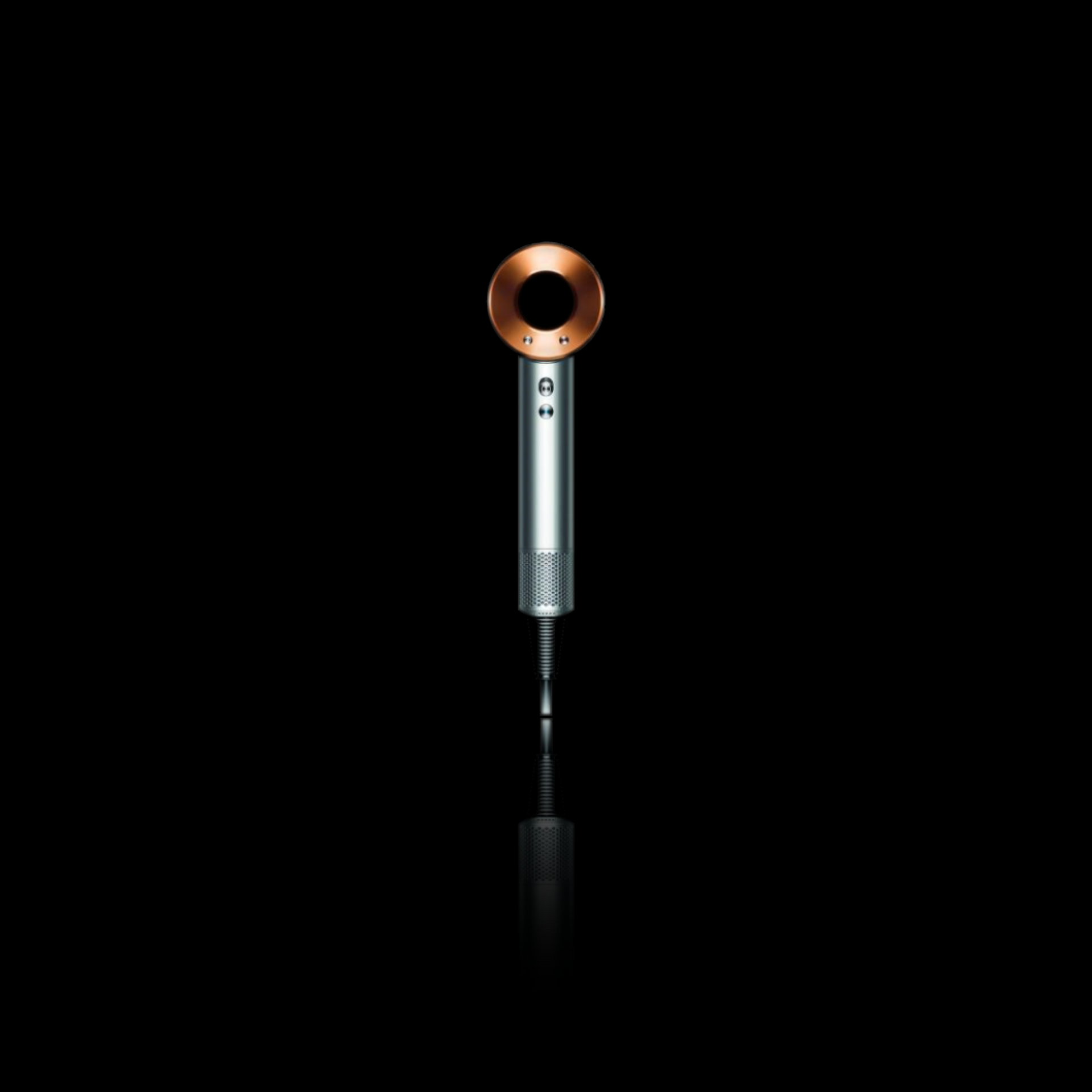
A meticulous work of art direction at its best: entrusted with an expansion of Dyson's style guide. Tasked to seamlessly integrate a new product presentation section, the challenge is not to revolutionize, but to masterfully navigate the extensive and precise guidelines. It is the art of balance in a compliant mix of layout, art direction, and infographics, respecting the established rules while introducing a refreshing approach to product presentation. Witness the challenge of combining design innovation within the bounds of tradition.

The Tequila you can sip: Agua de México
Handcrafted in Mexico's second oldest distillery (est. 1840), this award-winning tequila is celebrated for its exceptional smoothness, signature aroma, and rich flavor.
#ADMTequila

Explore a collection of logo design samples crafted over the years, ranging from unique venues and real estate management firms to non-profit organizations. It's always an honor to be entrusted with the creation of impactful branding origins.
Meet PUNCHIE: the pioneering hard seltzer meticulously crafted with the infusion of rum and cascara coffee fruit — a superfood renowned for its natural energy-boosting properties.
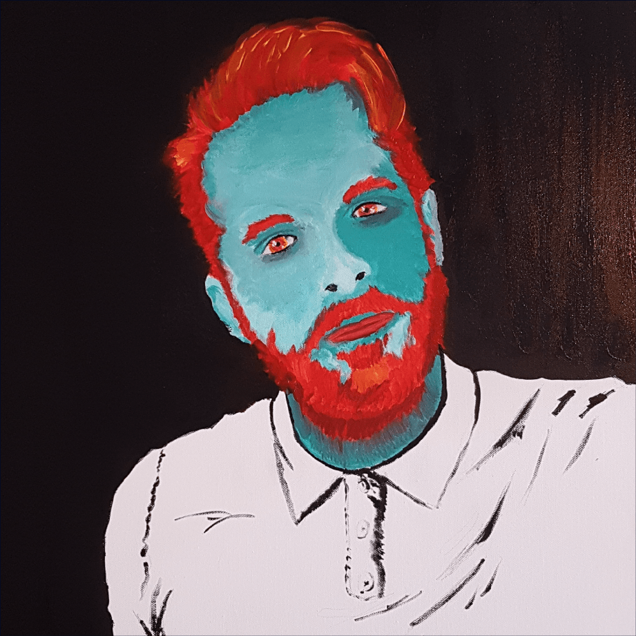
The solo activity that gives me the most satisfaction is probably painting. The conditions alone that necessarily have to occur: the time, the room and the quiet to exercise. The rewards of a won challenge like giving an eye a lively feel, or a daring color combination that ends up working out way better than expected, are nothing compared to the meditative effects painting brings along.
A short walk on Memory Lane with a few illustrations I created between 2007 and 2018.

Korina is a dynamic force of energy, and her vibrant spirit is truly contagious. My branding revolves around capturing her youthful and punchy essence. Through a series of static and animated 'chibis' (simplified cartoon avatars), I've created a visually engaging representation of Korina. The design is rounded off with playful cartoony confetti, embodying the lively energy she exudes.

For their 120th anniversary, Nellissen Interiors aimed to 'refresh the branding' and address a lack of pride in their visual identity. Launching a special collection to honor the true founder, Emily Nellissen, the brand sought to recognize her often overshadowed role. The new logo, inspired by 19th-century handwriting, embraces the brand's femininity, while a minimalistic portrait of Emily enhances the 'full' version of the mark for use in the anniversary year and special events.

Though I am not a Christian, rebranding the St. Andrews Orchestra in 2022 became more than a graphic design task. Balancing tradition with a modern, youthful look, my Bauhaus-inspired logo features bold shapes, maintaining a serious tone in black-and-white contrast. This design captures the essence of a traditional institution transitioning into modernism, offering a playful touch.